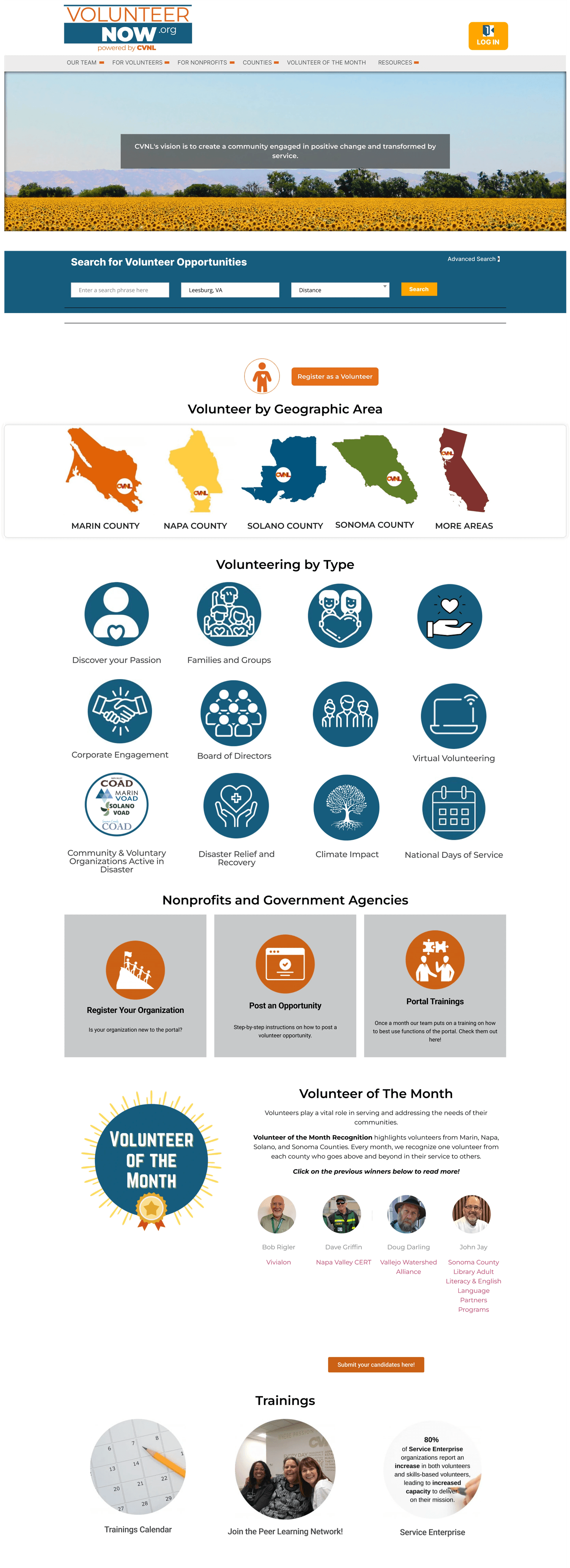
Volunteer Now is a site aimed at helping volunteers find the perfect way to give back to their communities.
Problem
CVNL was originally four county specific organizations (Marin, Sonoma, Napa, and Solano). Current local volunteer opportunities were siloed on individual websites specific to each county.
They began to create volunteernow.org to merge the existing sites and help match volunteers with opportunities matching their location and interests.
Unfortunately with the constraints of a nonprofit, CVNL wasn't able to hire a full time designer to finish their website, so it sat half built for years.
Solution
In 2020, I volunteered with AmeriCorps as a Volunteer Infrastructure Project fellow and took on creating the entire site on my own. Thus, igniting my passion for UX design.
My goals were to create a site that would:
allow volunteer managers to easily post opportunities and find high quality volunteers
help volunteers find opportunities that fit within their schedule, needs, and skills.
Empathize
Stakeholder Analysis
I began the project by getting input from the most important stakeholders:
CVNL's county managers, to see wants and needs for when I combine their county webpages into the singular, Volunteer Now.
Other nonprofits' volunteer managers, to see pain points and needs in a volunteer matching portal.
WebDev, to see where the project is before I begin and what programming constraints we face.
Volunteers, to see their pain points and needs for when they search for volunteer opportunities.
One challenge of this project was balancing the wants and needs of each of these stakeholders while also aligning product with CVNL's business goals.
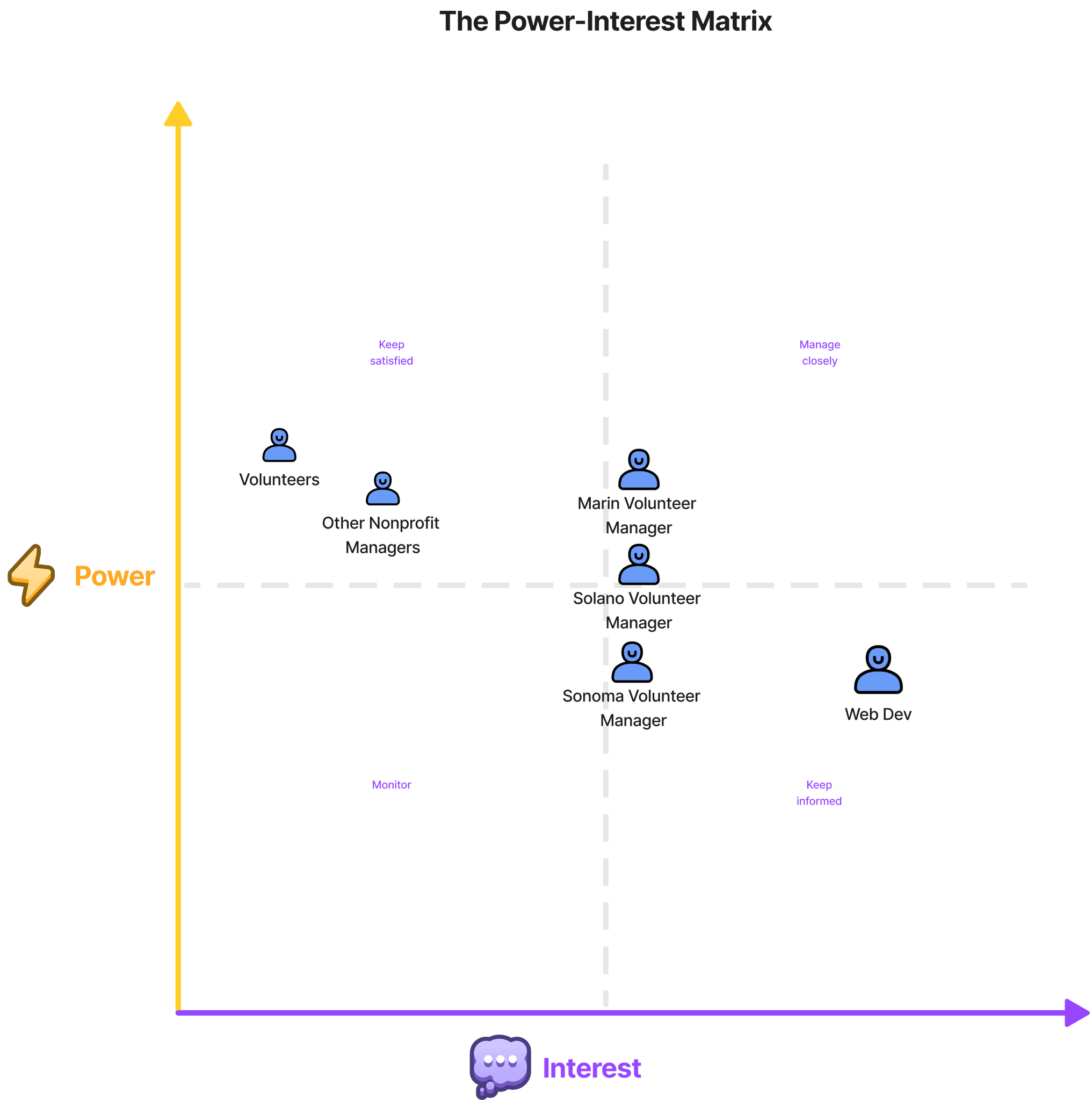
I would visualize stakeholders influence over the project with a power-interest matrix. This would help prioritize which stakeholders need the most attention and tailored communication strategies. As well as prioritizing and strategizing resource allocation based on stakeholders’ power and interest levels.
This especially would came in handy when attempting to balance the wants and needs of Sonoma, Solano, and Marin county's volunteer managers and reminded me to prioritize solving the pain points of the actual users, volunteers and other nonprofit managers.
Competitor Analysis
Catchafire
Catchafire connects skilled professionals with nonprofits for short-term, project-based engagements, such as website development, graphic design, and strategy consulting. It is geared toward experienced volunteers looking to make a meaningful impact.
Weaknesses
Text-heavy sections can feel overwhelming
Limited customization options for user profiles
Limited opportunities for casual or first-time volunteers
No interactive community space for volunteers to connect
Homepage only directed towards organizations
Strengths
Modern, visually appealing interface with consistent branding
Interactive design elements, such as progress bars and hover states
Clear hierarchy and structure for easy navigation
Recognition features (e.g., testimonials and project completion badges)
Strong emphasis on storytelling with impact metrics and case studies
Personalized dashboards for goal tracking and project management
Communication tools for direct messaging with nonprofits
Integrated dashboard to track active and completed projects
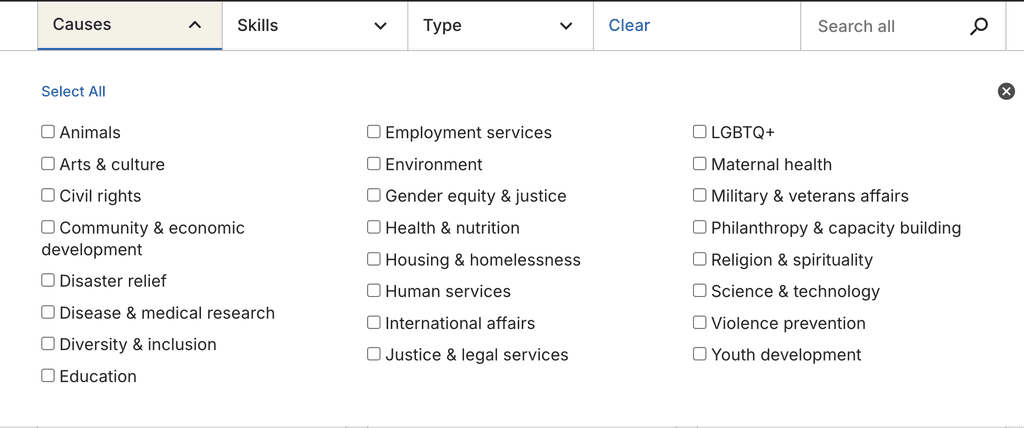
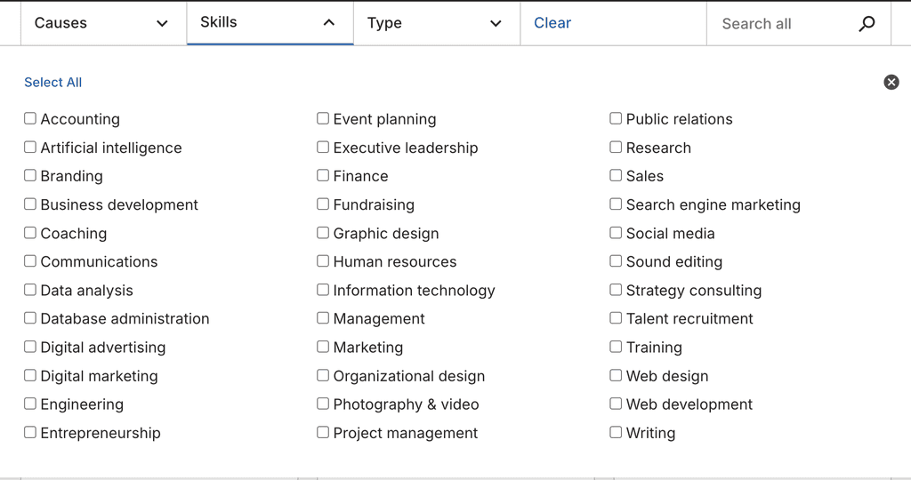
Advanced and easy to understand filters for duration, skills, and cause areas
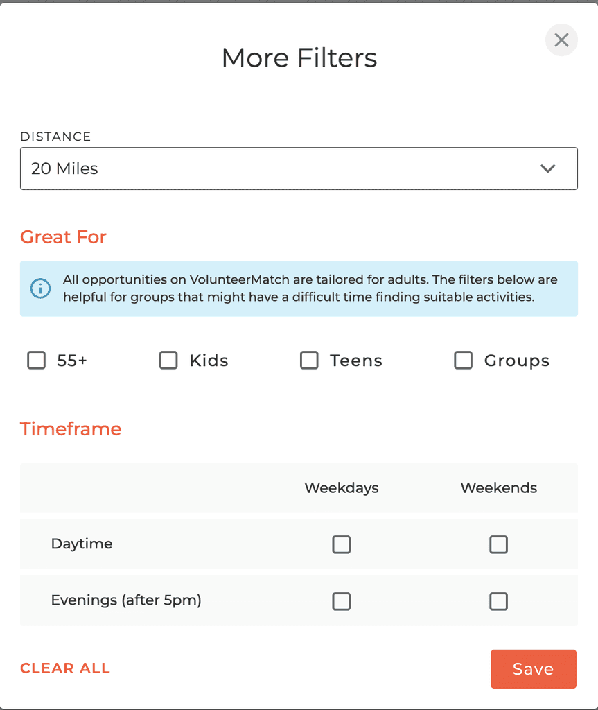
Catchafire helpfully organizes all filters so volunteers can quickly narrow down the opportunities that fit their skills and interests. Because it's geared towards working professionals, there are no age choices, something we need for VolunteerNow, as many of our volunteers are teenagers.
Volunteer Match
VolunteerMatch is a platform connecting volunteers with opportunities in various causes, ranging from animal welfare to disaster relief. It is designed to cater to first-time and experienced volunteers alike.
Weaknesses
Lack of interactive or dynamic elements, making the platform feel static
No gamification or community-building features
Limited feedback mechanism for users to rate or review opportunities
Limited centralized application tracking
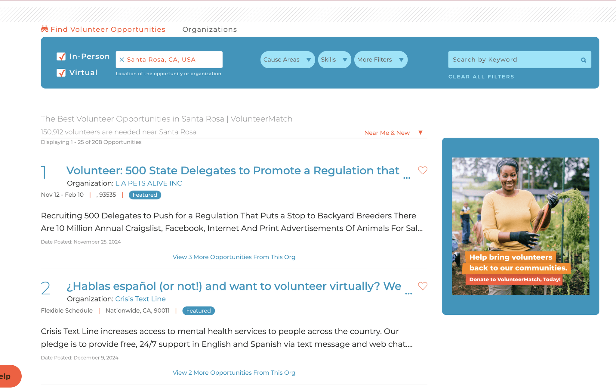
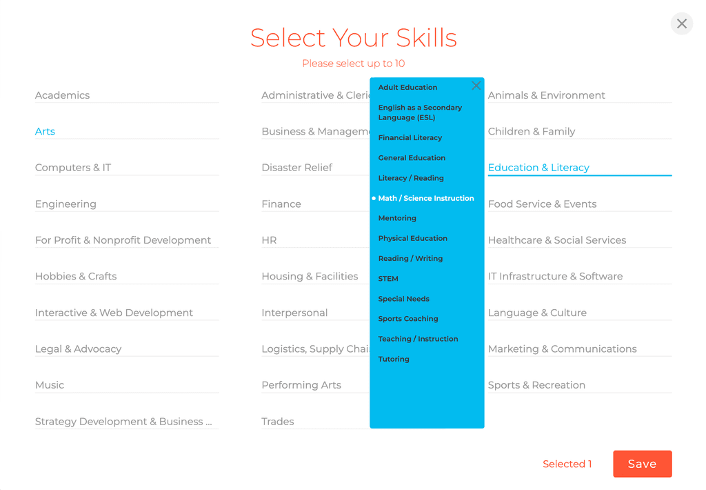
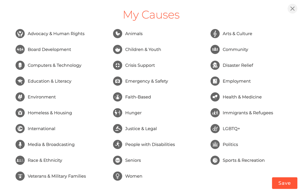
Filters are all different styles
Strengths
Regularly updated opportunities ensure relevance
Email notifications for tailored recommendations
Blog and success stories inspire users to get involved
VolunteerMatch applies many useful filters such as age, time available, skills, and causes which helps further find the best fit opportunity. Lack of consistent UI here could be a source of friction for users.
User Interviews
As part of my user research , I conducted in-depth interviews to explore the ins and outs of volunteer engagement. My goal was to uncover the motivations, challenges, and decision-making processes of volunteer managers, and people involved in or interested in volunteering.
8
Participants
4 Current and
potential volunteers
4
Volunteer Managers
22-55
Years old
Affinity Maps
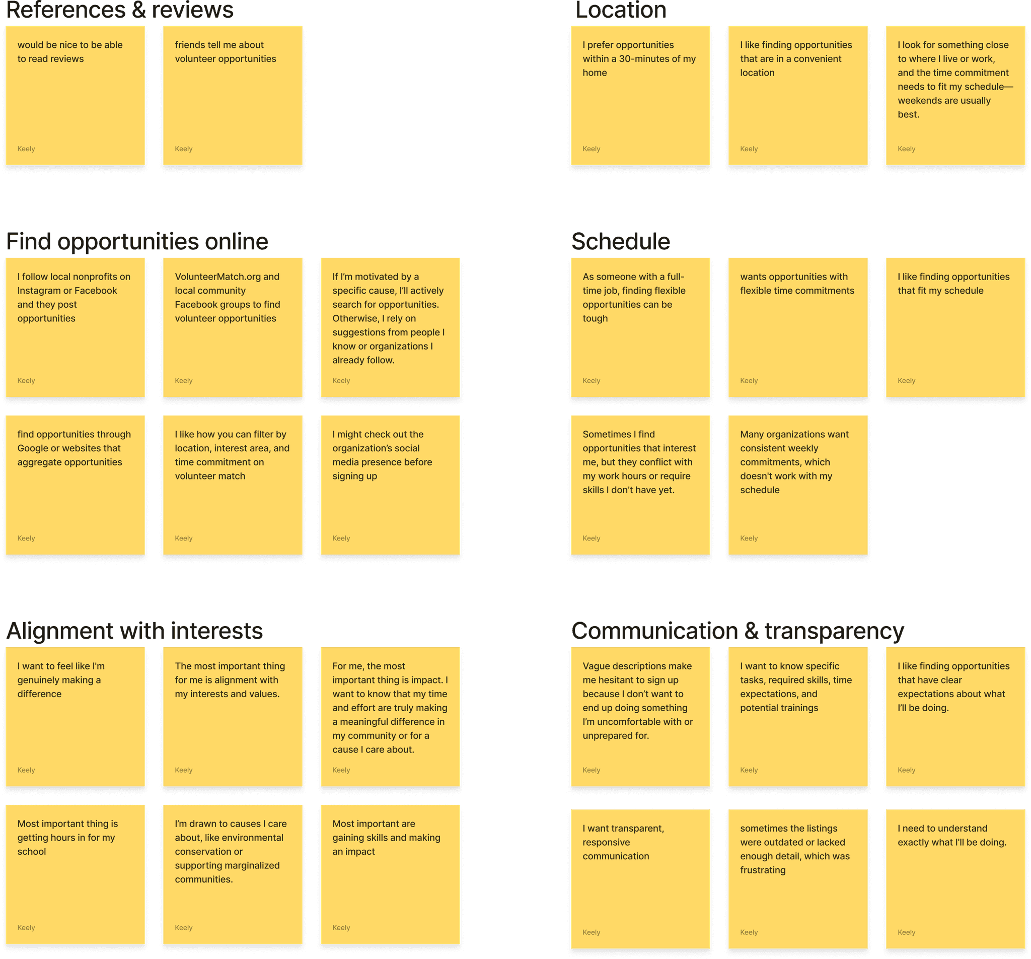
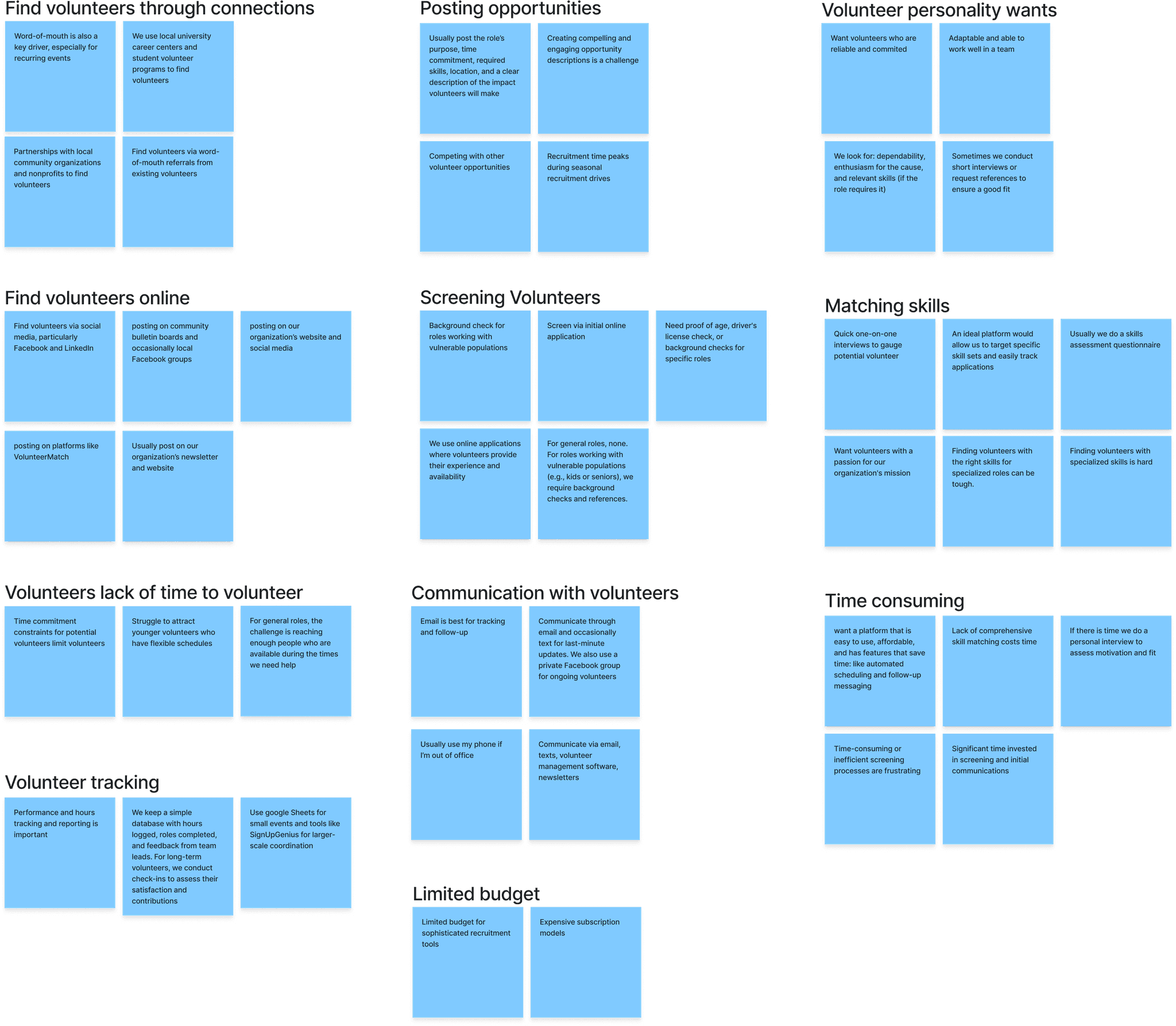
Following the user interviews about volunteer and volunteer managing experiences, I used affinity mapping to transform raw qualitative data into structured, meaningful insights, notably:
Volunteers want:
clear and quick communication from volunteer managers
detailed descriptions of opportunities
references from others via reviews or word of mouth
And opportunities which:
are close to home
fit within their schedules and are flexible
align with their interests
Volunteer managers want:
easy and quick way to screen volunteers so they match skills needed
ways to save time when recruiting volunteers
a way to easily track volunteers' hours, roles completed, and give feedback
ways to help them keep organized
And usually:
communicate via email
find volunteers online or through community connections
struggle with posting compelling, detailed opportunities
Affinity stickies grouped with common themes. Yellow are volunteers and blue are volunteer managers.
Define
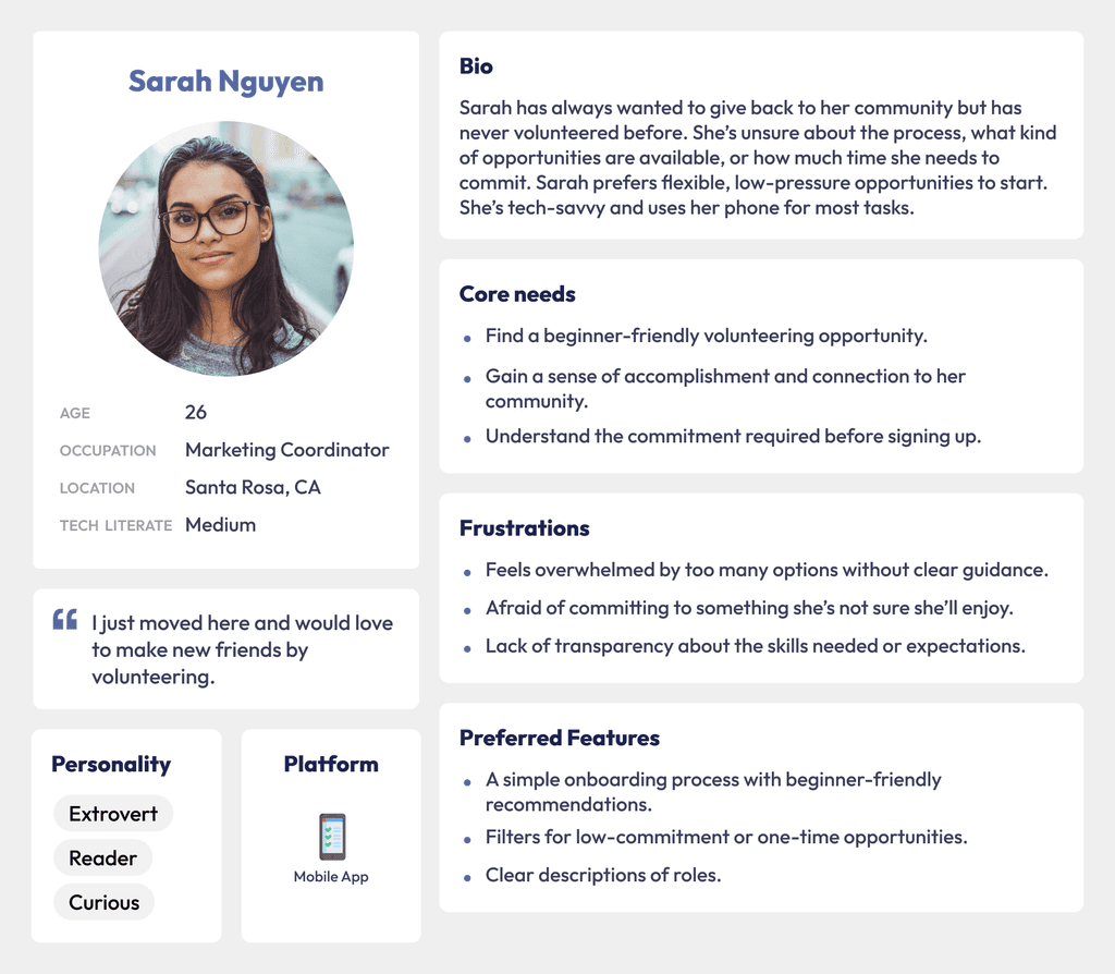
Personas
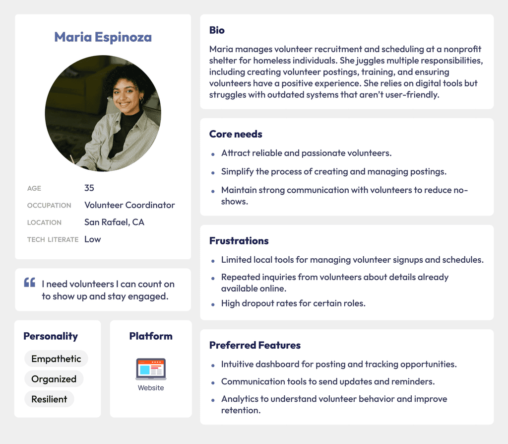
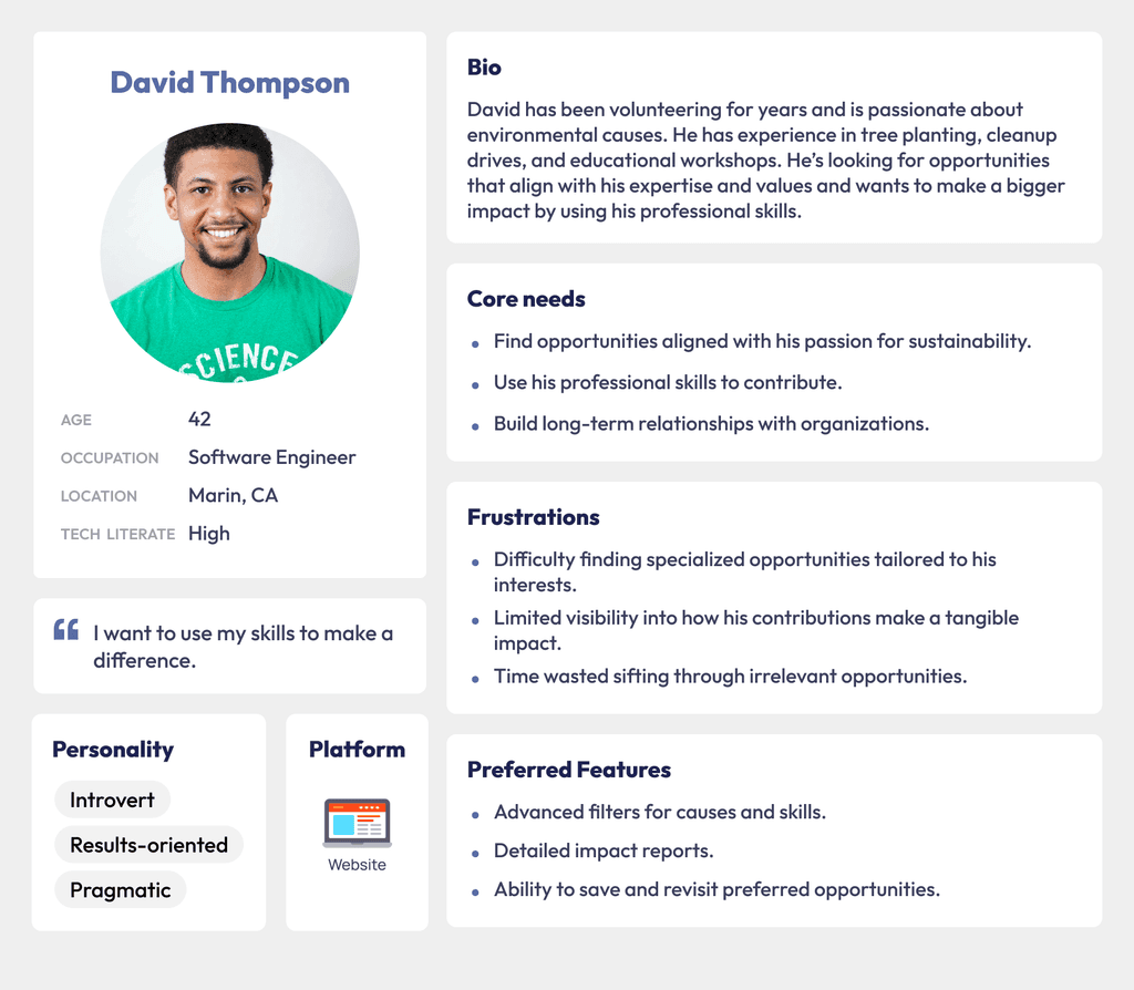
Through research on the business goals, I identified two key user groups, volunteers and volunteer managers. Within these groups, I identified three main users I would design for:
Volunteers:
First-time volunteers.
Experienced volunteers looking for specific causes.
Volunteer Managers:
Nonprofit staff who post opportunities and manage volunteers.
Personas were especially important when designing as it helped me keep in mind the sometimes conflicting needs and wants of each type of user, the volunteer manager, and volunteer.
User Journey
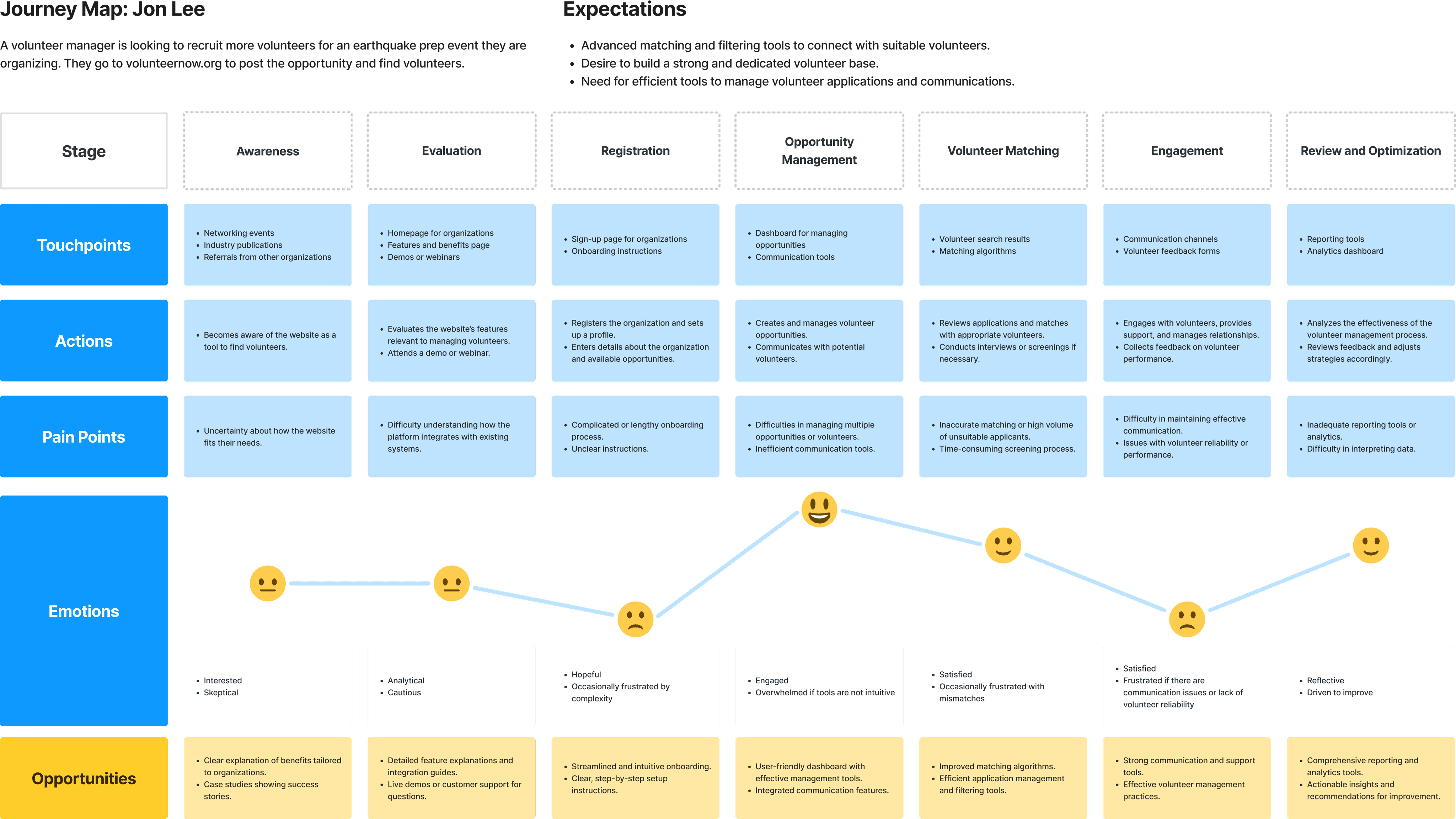
This user journey map is a visual representation of a volunteer manager's experience searching for software to improve their ability to find volunteers. It outlines the steps, thoughts, and emotions involved in this process. This helped me to understand the client’s needs and challenges and to create intuitive software solutions that enhance the engineer’s capacity to support clients effectively and efficiently.
Ideate
Red Routes
Based on the user personas, I created two red routes. The first is how a volunteer manager uses Volunteer Now to post their volunteer opportunity and find qualified volunteers.
The second is how a volunteer finds and signs up for the perfect volunteer opportunity using Volunteer Now.
Existing Site Map
Given the existing site maps for the initial four county-focused websites, our challenge was to seamlessly integrate these, all the while ensuring an equal distribution of each county's volunteering openings.
Points of friction I found when auditing the existing site layout were:
Single sign in for both volunteer managers and volunteers can lead to confusion. Especially because the "make an account" button only leads to volunteer account creation page
Page repetition: many pages appear under both "For Volunteers" and "Resources"
Red routes hidden under disorganized menu
The specific resource pages for volunteers and nonprofits might be relocated under their respective menu items for effortless discovery.
Reworked Site Map
Here, I've reworked the original site map into a more streamlined approach which takes out redundancies within the main menu and minimizes the friction for users.
Many pages could be combined with others or removed as they were filled with redundant information. Such as the "Resources for Board of Directors" explained a volunteer opportunity that was no longer available.
Sketches and Wireframes
If I were to begin this project again, I would have initiated with sketches and wireframes for the critical red route sections prior to delving deep into a hi fidelity model. In hindsight, this missing phase elongated the project duration since I jumped into the complex realm of Wordpress without a coherent design concept.
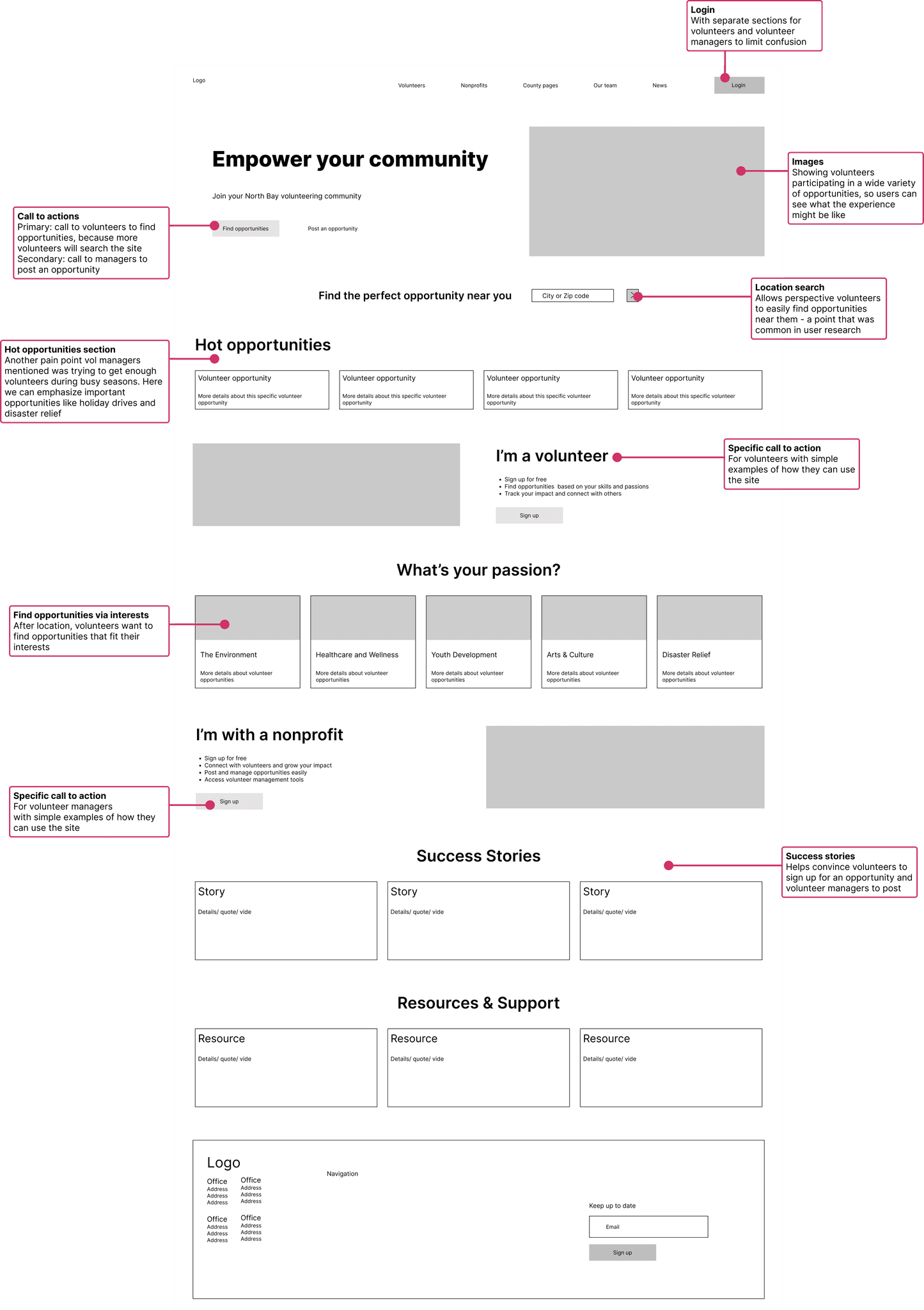
Wireframes of the homepage web and mobile version.
The current site was built in 2021 and now has some outdated UI. As well as improving the UX, I'd like to modernize the UI so users and managers have a quality experience.
Accessibility and Colors
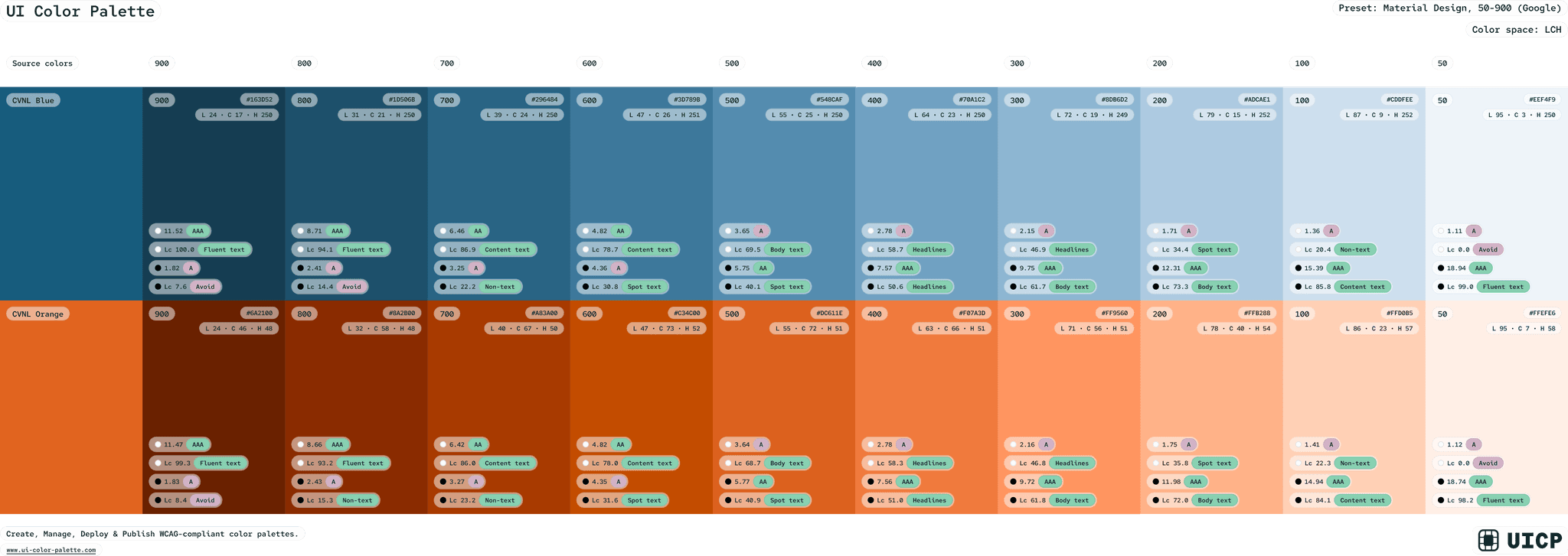
CVNL already has brand colors, the below blue and orange. One thing I should have considered was adding varying hues and shades to improve accessibility of the site.
Prototype
During my first design, I worked directly in Wordpress and jumped directly into creating the hi fidelity mockup. Now, I used Figma to map out a design system and mockups for user testing before applying them to the final design.
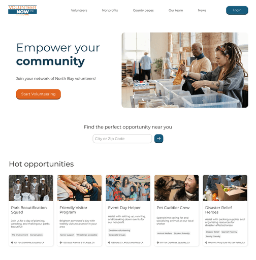
Homepage
Design Improvements
Simplified search to what volunteers care about most - location
Clear call to actions
Cleaned up volunteering categories to have better copy (whats your passion) and a scroll to limit clutter on the page
Hot opportunities section with the most common volunteer asks - location, description, and interests
Success stories to inspire sign ups
More images of people to create an emotional connection and increase engagement
Better UI focusing on design systems and accessibility
Mobile optimized design
Created and utilized a design system to ensure design cohesiveness
Login & Sign up
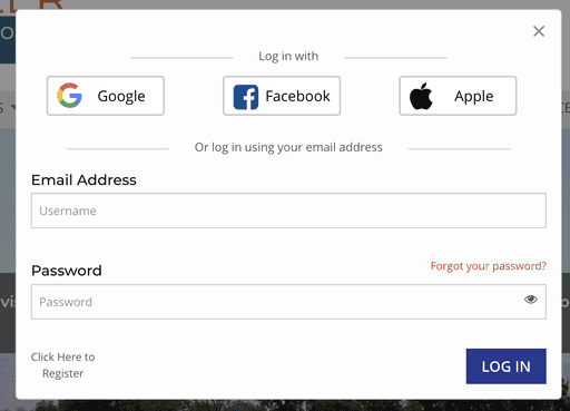
Above is the login designed in 2021. Below is the new redesign of the Login and sign up pages.
In the old design the sign up (register) page for volunteers was the only one linked to the "login" button. This caused confusion as nonprofits were not sure where to sign up. There was no clear call to action on the homepage which left them lost.
Also, users were not sure who this login was for, nonprofits or volunteers?
Design Improvements
Now clear who the login is for (volunteers AND nonprofits)
Volunteer sign up page links to login and nonprofit user sign in
Nonprofit sign up links to login and volunteer sign up
More modern and friendly UI
Images to keep users engaged and tell the brand story
Usability Tests
When first designing the site, I conducted a site review by encouraging colleagues to navigate it and voice any difficulties they stumbled upon as they navigated through. I also interviewed volunteer managers to find where friction was in the design.
Were I to attempt the project now, I would assemble a team of volunteers and volunteer supervisors to carry out usability tests. I would instruct them to undertake tasks and deduce the areas of design friction based on their feedback.
One day when I have more time to dedicate to this project I would love to perform usability tests on the new design. For now, I am content with knowing the new design is data backed and follows UX design principles.
Reflecting on my past design abilities is a little embarrassing, but also immensely rewarding to observe how much my creative skills have matured.
I'm confident that with continuous learning and personal growth in the field of design, my skills will only improve.
Let's talk about the next big thing!
Reach Out
