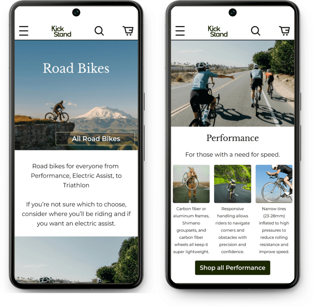
Kickstand began as a design challenge based on the prompt to help improve the checkout flow of a biking e-commerce site.
This was a capstone project for Springboard’s UX/UI certificate.
Tools
Miro
Figma
Figjam
Team
UX/UI designer
1 project manager
My Role
UX design
UX research
UI design
Timeline
Overall: 3 weeks
Discovery & Research: 1 week
Design & testing: 2 weeks
Problem
Data from a biking e-commerce site shows:
50% of users open on average 7 item pages and then abandon the site without moving any items into the cart.
Additionally, 70% of users who place an item in the cart do not purchase. Data shows that users abandon the cart at the registration page.
How can I improve this flow and retain more customers?
50%
of users open 7 item pages then abandon the site without moving any items into the cart
70%
of users place in item in cart but do not purchase
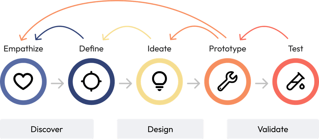
Empathize
Industry Assessment
For this project, I began by assessing industry leaders; Target, Amazon, and Trek Bikes. Once I became familiar with the industry standards for bike checkout flows, I interviewed users to learn what these industry leaders might be missing.
Interviews
During the ideation phase of the project, I conducted user interviews to build new personas and to inform the design. I prepared an interview script with 15 open-ended questions, focusing on our target audience’s values, motivations, and past experience buying bikes. In three days, I recruited and interviewed four users remotely over zoom. I referenced the user interview findings throughout the entire design process.
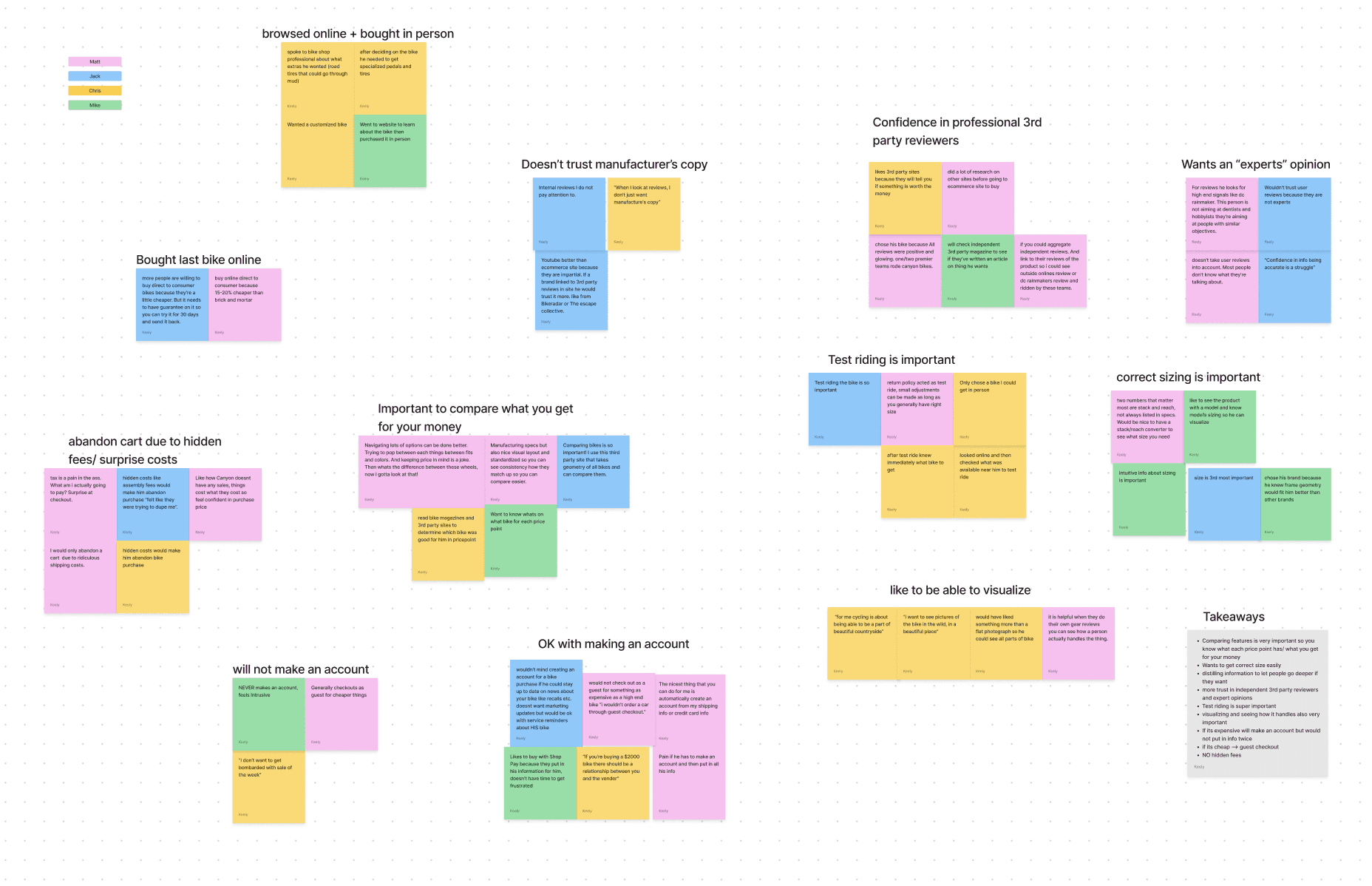
Affinity map stickies grouped into common themes found during user research
Define
Affinity Map
Based on user interviews, I created an affinity map to assess users needs, wants, and pain points. The data gained from interviews gave important insight into the design - the most important being that our initial hypothesis was not correct.
The PM hypothesized that the reason people abandoned the cart at registration was because they would prefer a guest checkout option. However, nearly all of our interviewees said that if they were buying an expensive item, such as a high end bike, they would like a “relationship” with the company. Because of this insight, I included a “remember this information” for faster checkout checkbox so users can quickly checkout through guest checkout but then also feel secure in their purchase and their relationship with the shop.
Personas
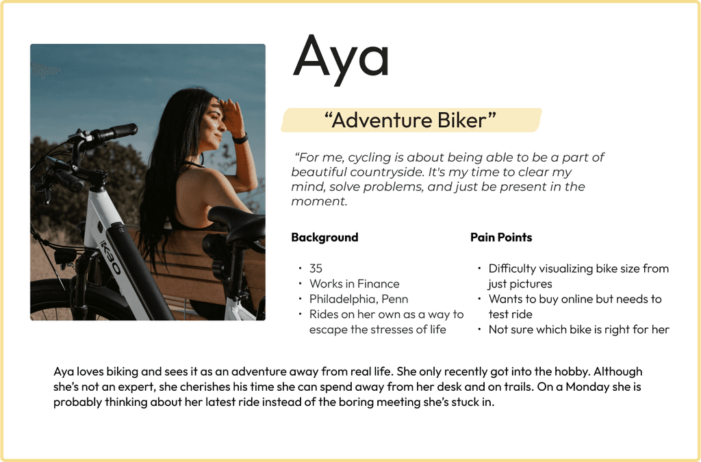
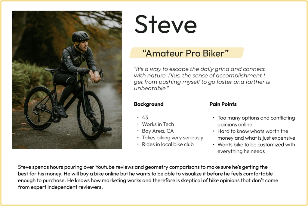
I created 2 personas based on findings of users' goals, needs, experiences, and behaviors. Personas were especially important when designing the hi fidelity mockup as it helped me keep in mind the users want a visual “in person bike shop” feel when shopping for a high quality bike.
Ideate
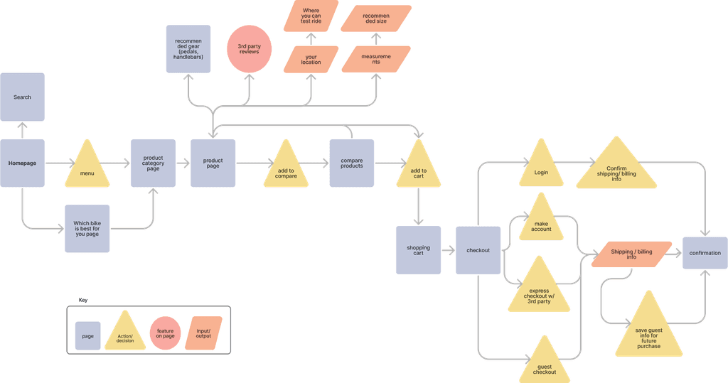
Site Map
With the business goal in mind, I made sure that our users reach the checkout screen without any issues. So, I sketched a site map to identify opportunities for improvement. In the existing flow, users must put in their name, phone number, email, and password before they can even begin the checkout process. My goal was to simplify this flow and bring users quickly to the end of the checkout process before they abandon their cart.
Prototype
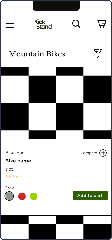
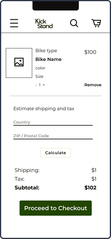
I began the design process with low-fidelity wireframes in Figma to accelerate decision-making through visualization. My wireframes were based on the initial user interviews, the business goal, and the site map. Each pointed to the fact that:
The checkout process could be more streamlined
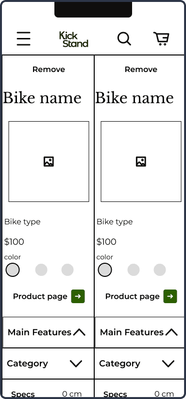
Users needed a better way to compare bikes
I came back to these first iterations throughout the entire design process to make sure that I didn’t lose sight of my primary goals and ideas.
Test
I created a fully-functional, low-fidelity prototype of the flows using Figma. At the same time, I started recruiting subjects for the test who fit our criteria. I completed 5 usability tests in the first round using the wireframes and then 5 using a fully-functional, high-fidelity prototype after iterating on the issues identified in testing:
Issue 01
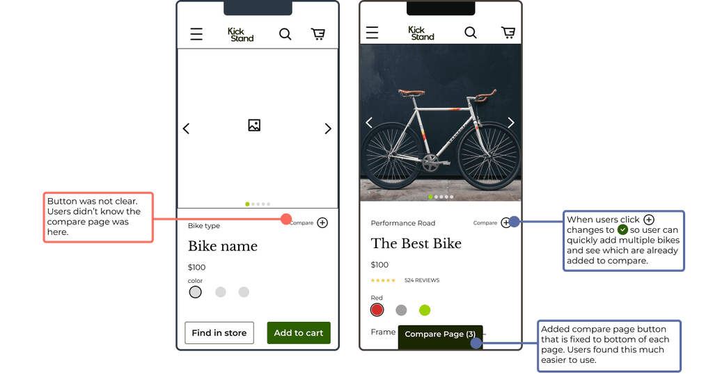
Users were unable to find the compare products page. Nearly every user I tested had this issue.
Solution 01
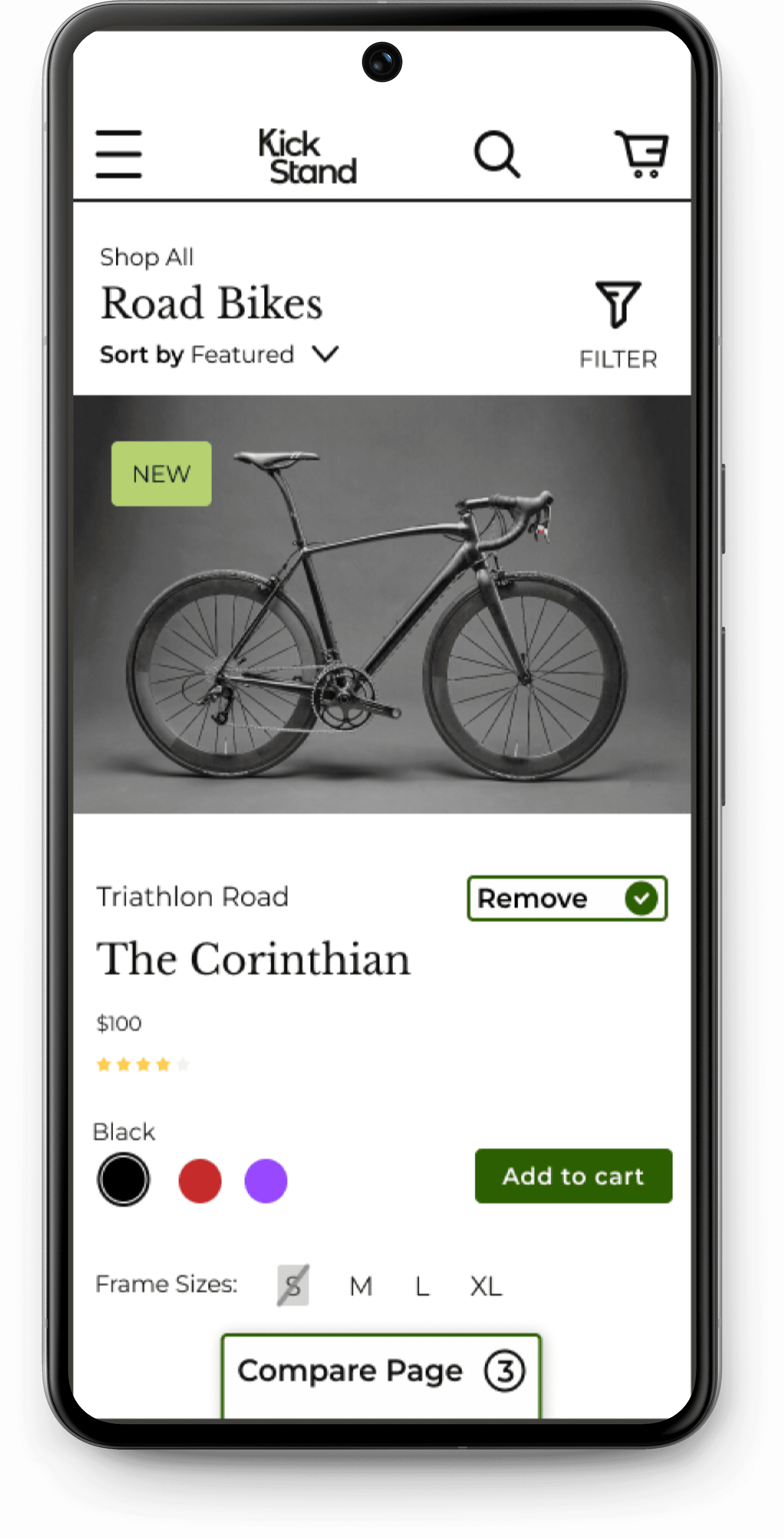
I played with a few solutions from adding a compare button to the menu, to adding one on each product card. From a quick survey from user’s tested, I found there was a clear preference for a bottom bar button on each page.
UI Design
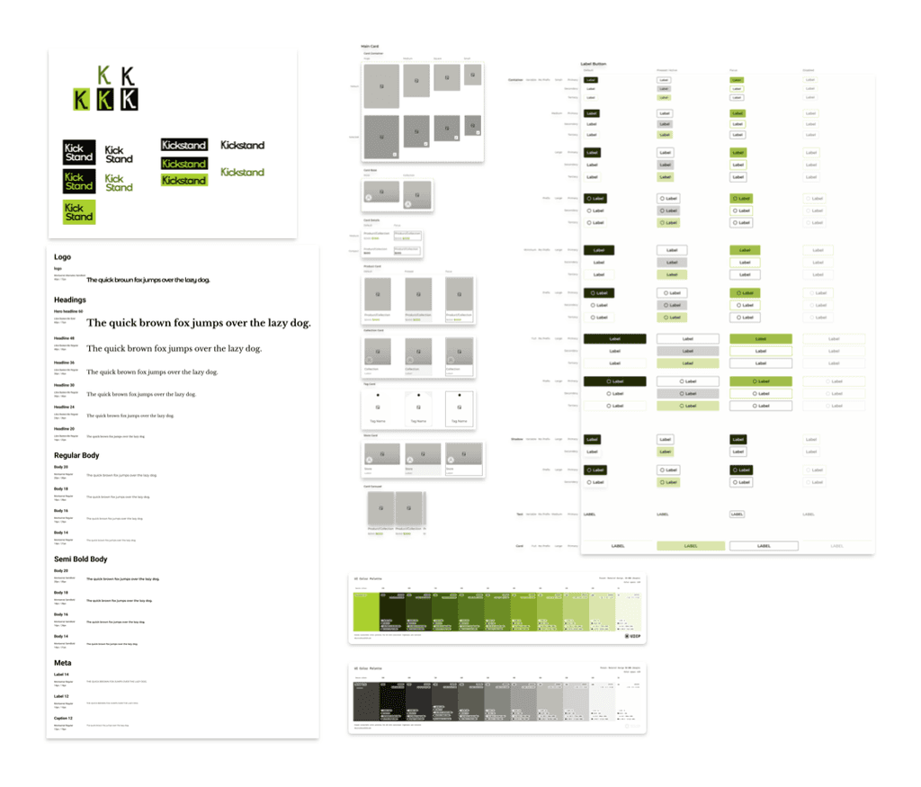
Overview of Kickstand's UI and beginnings of the design system.
After making tweaks to my wireframes and turning them into a fully-functional, high-fidelity prototype, I began usability tests round 2. Some issues users identified were:
Issue 01
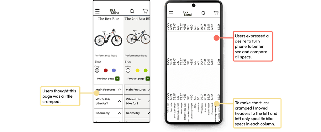
Users were unhappy with the layout of the compare page and wished it could be turned horizontally so they could see all specs.
Solution 01
I changed the compare page layout so that all headers were only on the left side, which freed up space in the columns for an isolated view of each bike's specs.
Issue 02
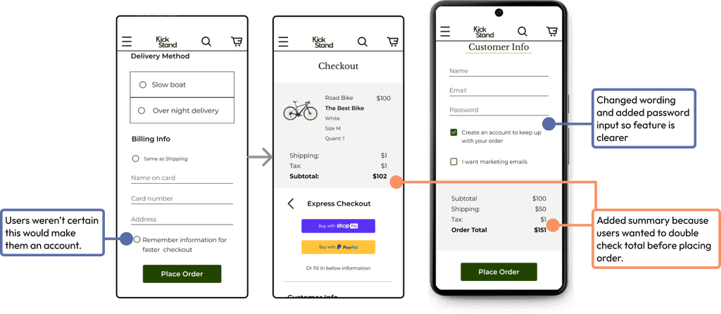
In checkout, users had expressed a desire for automated account creation so they can track their order. The button for this feature wasn’t clear. Users also expressed annoyance at having to scroll all the way back up to double check order before paying.
Solution 02
Changed wording to “create an account” from “remember information” and added a password input so it’s clearer you can make an account with your inputted information. Also, I added an order total summary to the bottom so users did not have to scroll all the way back up.
Let's talk about the next big thing!
Reach Out


