Spearheading the Zero Emission Vehicle Transition
Working with the client, EquiCharge Solutions, this program is a way to bring the improve the scope of green energy consultants everywhere.
Tools
Miro
Figma
Figjam
Team
1 client
My Role
UX design
UX research
UI design
UX team lead
Timeline
Overall: 4 weeks
Canada’s emissions broken down by sector. To complete their goal of zero carbon emissions by 2050 there needs to be a drastic overhaul of vehicles to zero emission models. This program aims to solve the biggest issues for businesses in making the switch.
Empathize
For this project, we began by meeting with the client and finding out clearly who the users are and the project scope. Then we dove into secondary research to see what competitors were doing.
Competitor Research
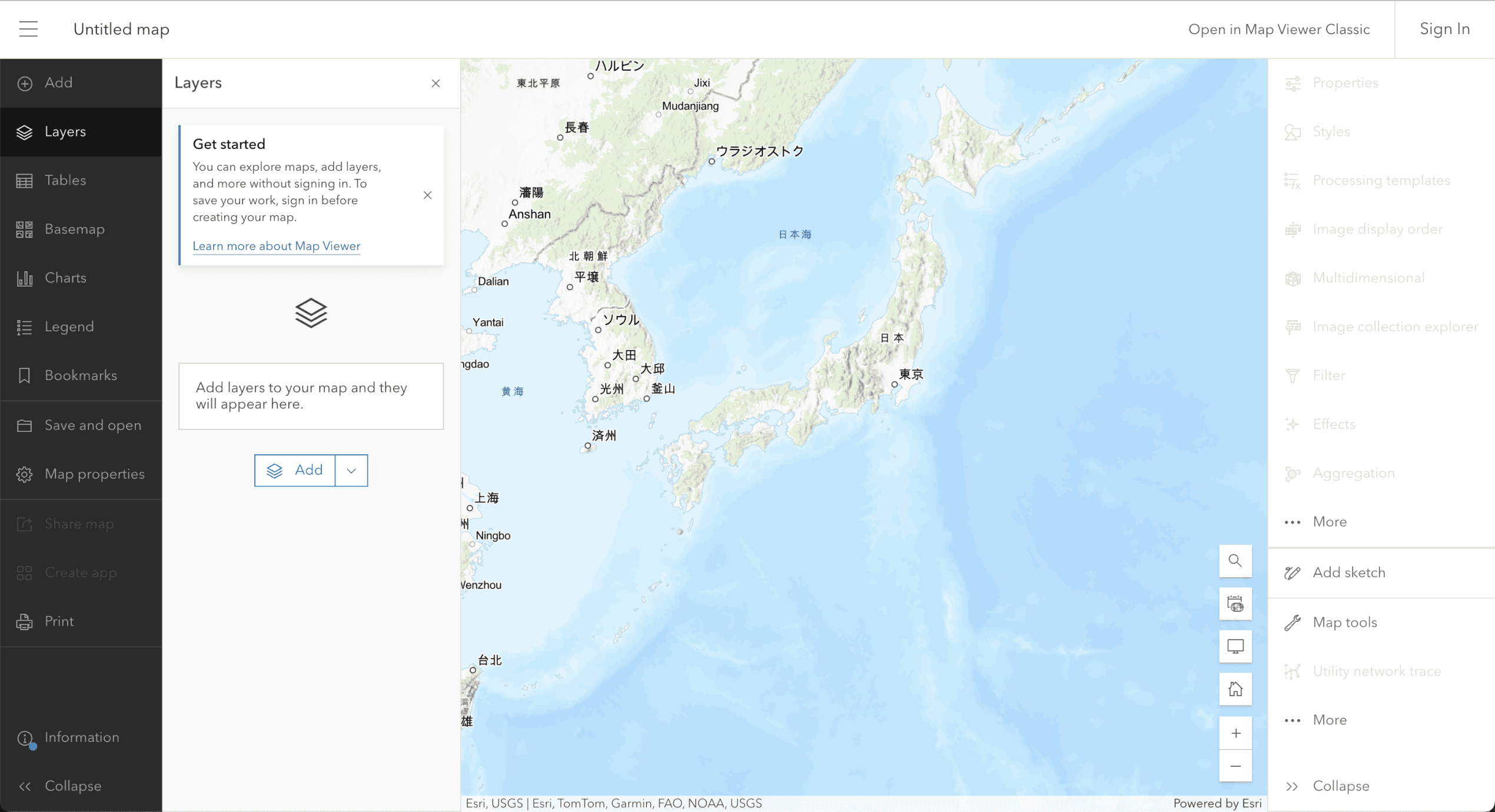
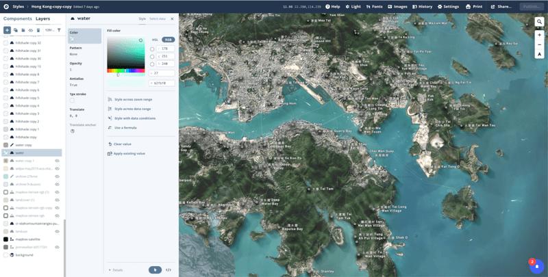
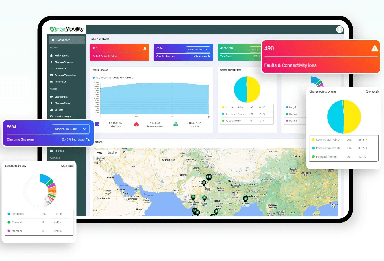
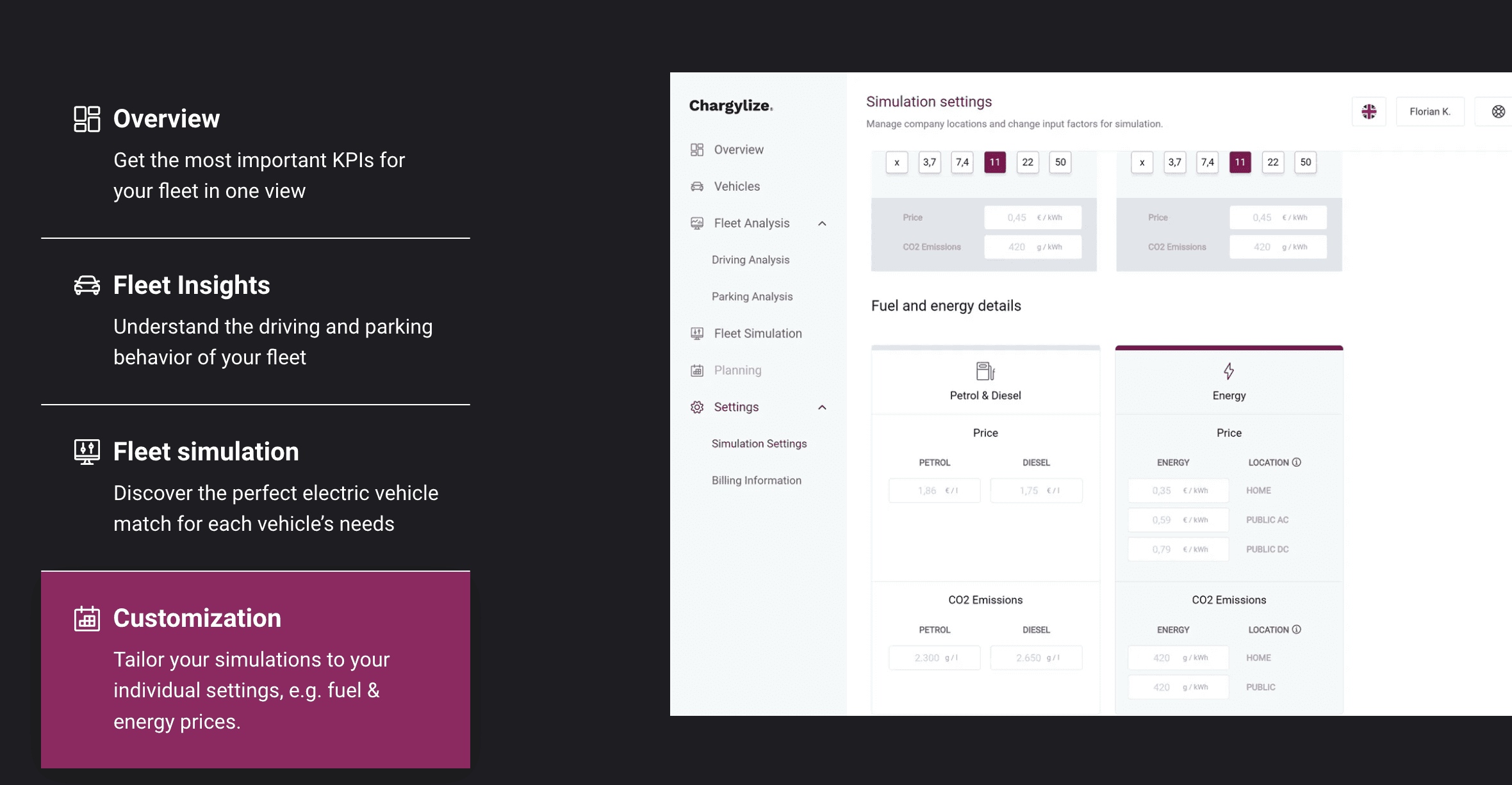
During the ideation phase of the project, I looked at sites with similar business goals to see what are the industry standards.As it was my job to focus on the live map and configuration pages, I looked at mapping software such as mapbox, and ArcGIS. And other EV fleet management software like VerdeMobility and Chargylize. What I found is that there are other softwares doing similar things, but not completely and as end to end of the entire lifecycle as EquiCharge’s SAAS will accomplish.
User Journey Map
Based on client meetings and background research on the clients and the problem space, I created the below user journey map for one of the personas.
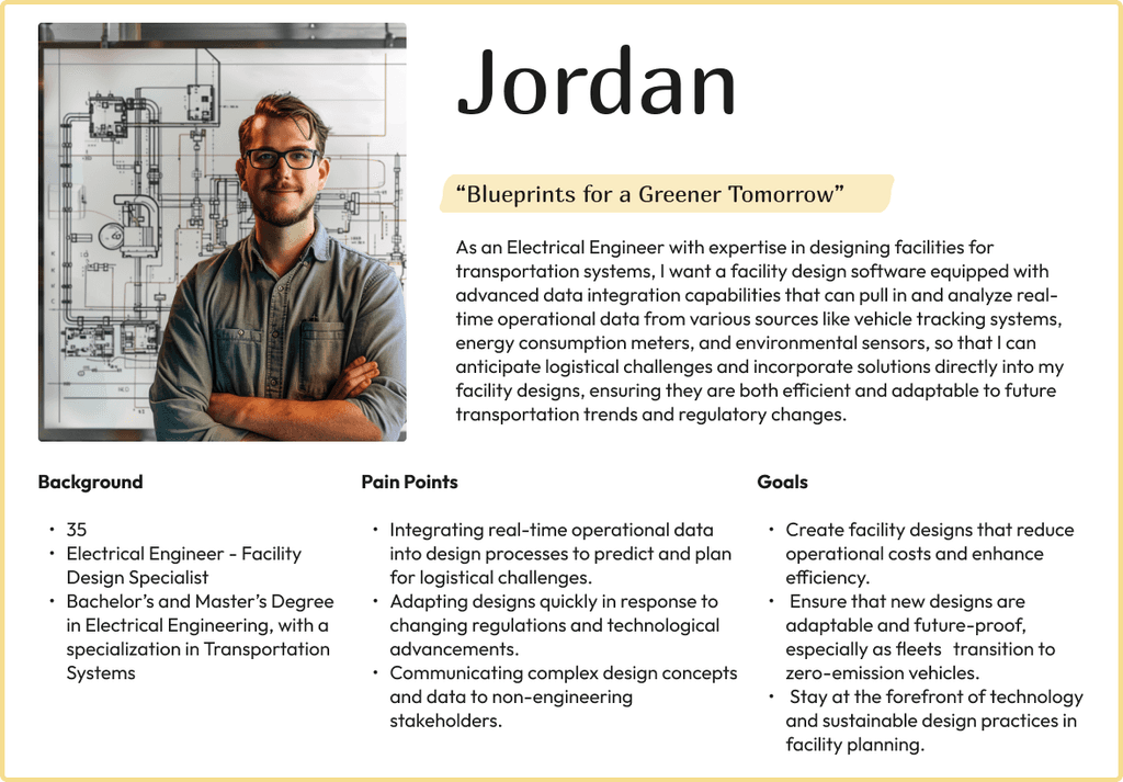
This user journey map is a visual representation of an engineer (Jordan’s) experience searching for software to improve their ability to help clients transition their fleets to electric vehicles (EV). It outlines the steps, thoughts, and emotions involved in this process. This helped our design team to understand the client’s needs and challenges and to create intuitive software solutions that enhance the engineer’s capacity to support clients effectively and efficiently.
Personas
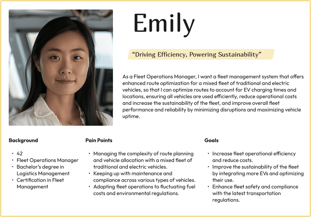
I created two personas based on findings of users’ goals, needs, experiences, and behaviors. Personas were especially important when designing the wireframes as it helped us focus on solving the user’s pain points and help them accomplish their goals using this software.
Ideate
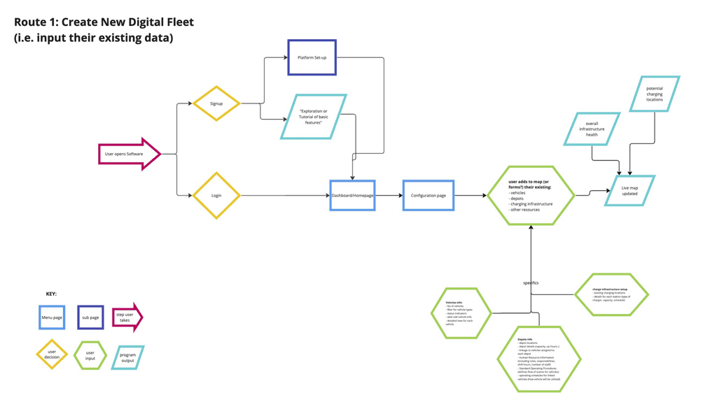
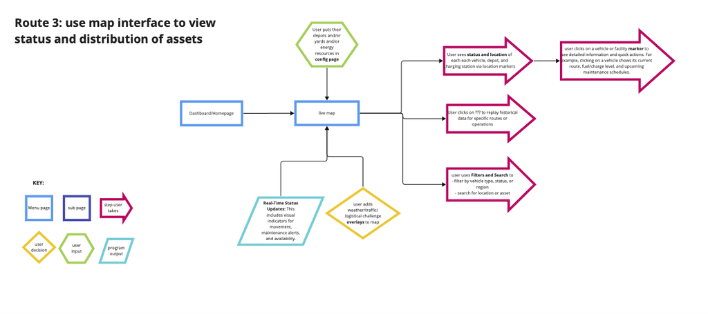
With the business goal and users in mind, we made sure that our users can configure, simulate, and manage their fleets without any issues. So, I sketched these red routes to identify main pages and flows we will need to build into the product.
This first route will be a possible first step a user must take when they download the software, inputting their existing fleet information to then run scenarios on. The client wanted this and the next route to be used backwards and forwards so I kept this in mind as I designed route 2.
This second route will be the second or first step a user must take when they download the software. Using their existing configured data they can run simulations to make their existing setup more efficient. This can also be used as the first step if a user does not have an existing fleet. Users can drag and drop elements onto a map and create different scenarios based on different possible fleet configurations.
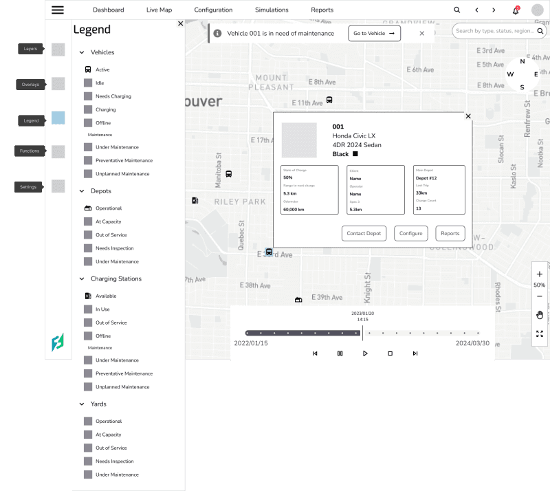
This last route will be used after the routes have been configured and analyzed in simulations and then built. This page will be a live map that tracks a users fleet and gives status updates to ensure peak efficiency of the fleet.
Due to time constraints, I prioritized features that would make up the Minimum Viable Product. Using the red routes, personas, and journey map, we discussed with the client their vision, users’ most pressing needs, and what would be achievable in the timeline of the project.
We decided to focus on three features: the map interface, configuration of fleets, and the fleet simulator as they were most important in achieving the business goal and our three person team could complete them in the short time span of the project.
I began the design process with low-fidelity wireframes in Figma to accelerate decision-making through visualization. My wireframes were based on the initial interviews with the client, the business goal, the user journey, and the red routes.
I came back to these first iterations throughout the entire design process to make sure that I didn’t lose sight of my primary goals and ideas.
Although it was not within the scope of the project to perform usability tests with potential users, we conducted some internal tests within our design team and had frequent checkins and feedback sessions with the client.
Issue 01
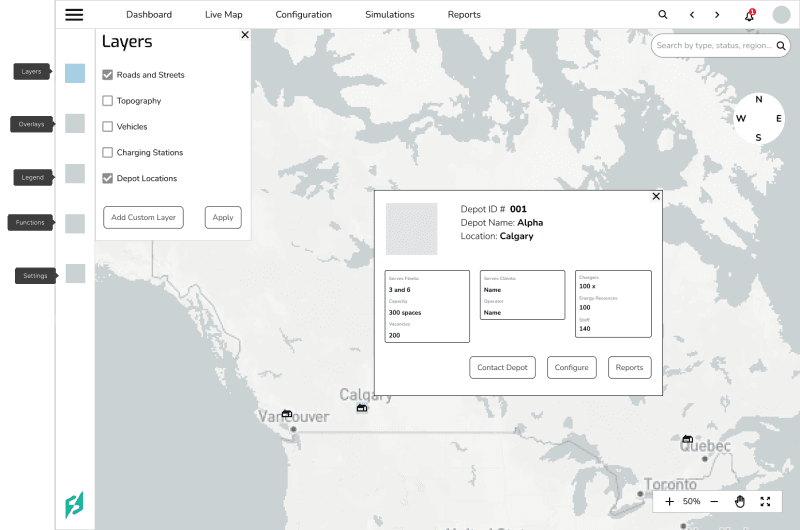
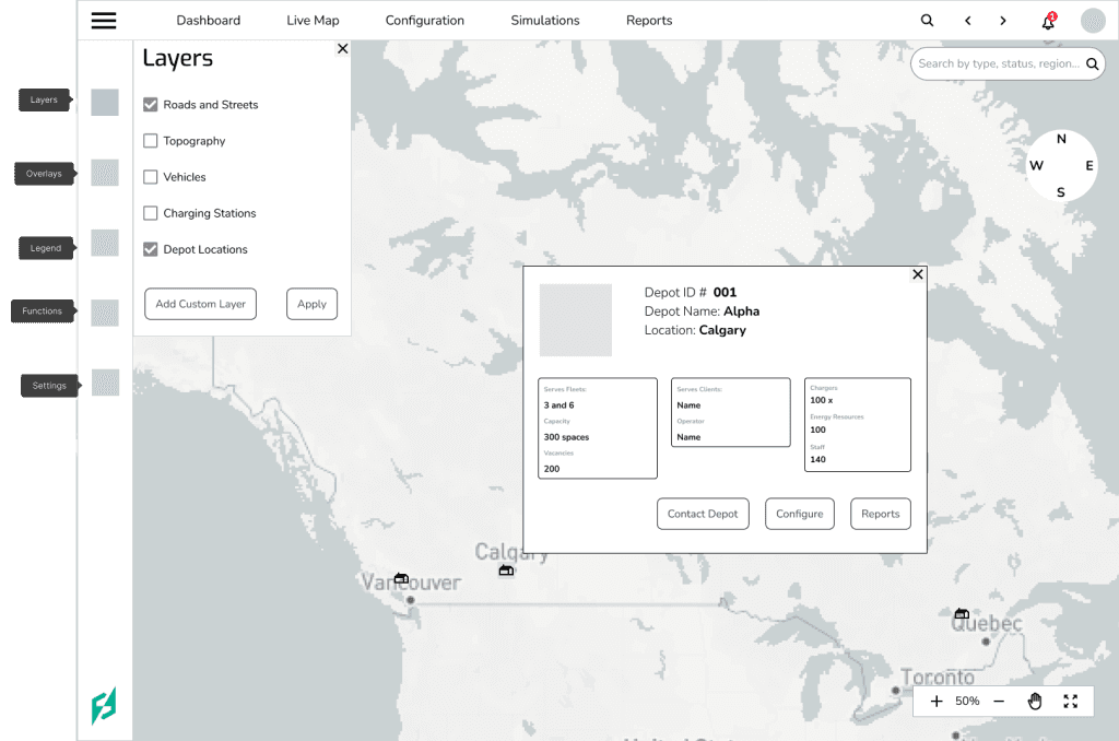
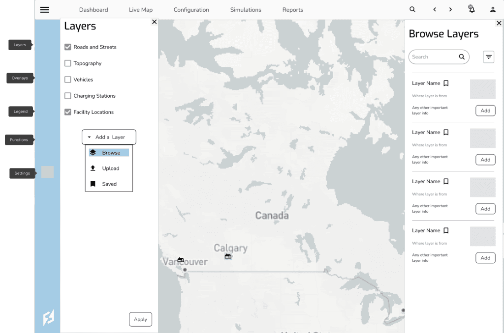
The client wanted maps to be able to choose other basemaps and layers provided by the software and not only provided by the user.
Solution 01
Added a button to choose how to add a layer and then another pop out menu that allowed users to save and search for layers.
Issue 02
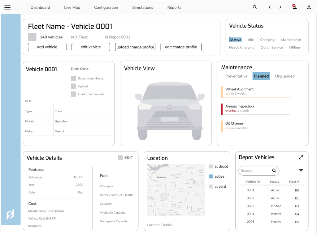
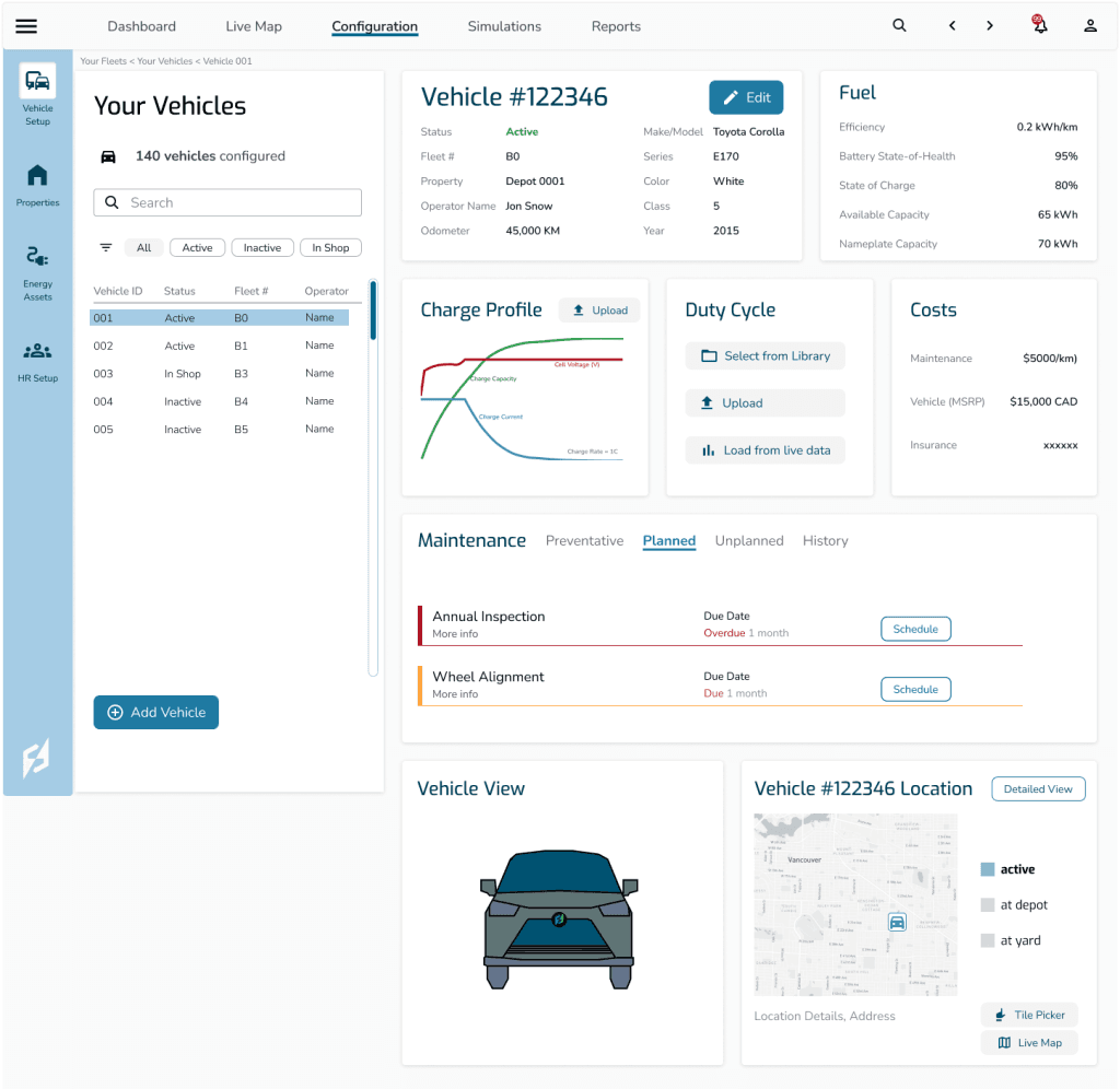
For the configuration page, there needed to be a way for users to input and see their configured vehicles to then run simulations on them. For the most accurate simulation, users needed a dashboard that was easy to use, customizable, and fully comprehensive of their vehicles. In the first iterations, the information was difficult to follow, there wasn’t much visual hierarchy or grouping of similar information. Also the quick shift between vehicles in a depot was small and in the bottom right, which we assessed was difficult to see.
Solution 02
I changed the vehicle selector to be a menu on the left hand side so users could search or filter by vehicle types and quickly choose one to show on the dash. I also reorganized information for quick scanning of fuel, costs, and basic vehicle information.
Issue 03
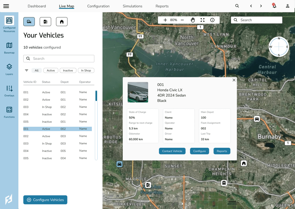
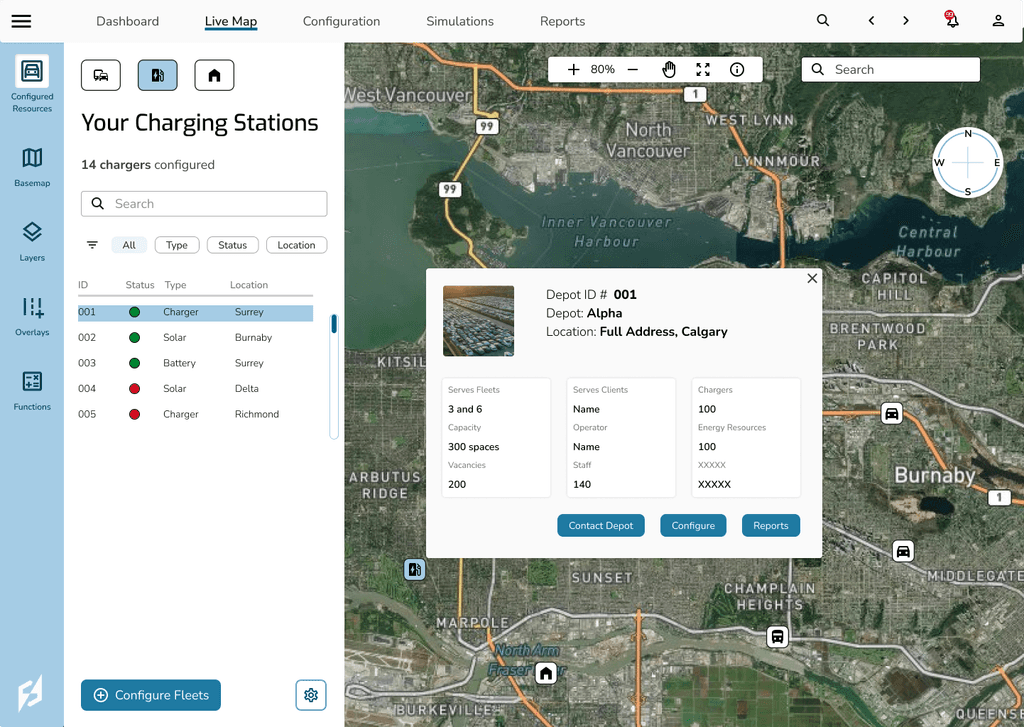
After testing the user flows on each red route, we found that there was no way to see a quick overview of vehicles, chargers, or depots on the map layer.
Solution 03
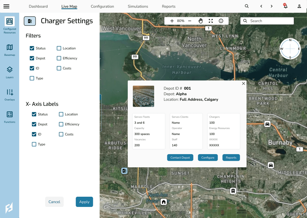
Added a configured resources page and buttons to switch back and forth between overviews of all configured vehicles, chargers, and depots. Users can also filter by status. After feedback from the client, I realized that since there are very different users, fleet managers, engineers, these filters should be able to change for the users needs. So next I added a settings page so users can change what information shows up on the spreadsheet and filters for each page.
Unfortunately within the scope of the project, we were unable to do user testing with multiple outside users. So for the continuation of this project I would make a clickable prototype which I could test on potential users to solve any usability issues.
Let's talk about the next big thing!
Reach Out

